Saturday, April 3, 2010

A Curatorial Concept: My Dream Conceptual Art Exhibit


Dan Flavin, "Green"

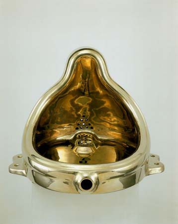
Sherrlie Levine, "Fountain (after Marcel Duchamp: A.P.)"

Gordon Matta-Clark, "Splitting"


Cy Twombly, "Untitled"


Sol Lewitt, "Wall Drawing"
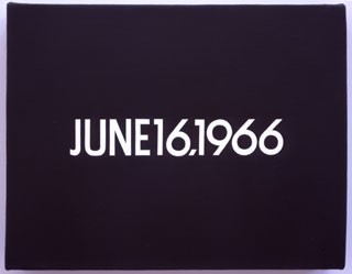
On Karawa, "June 16, 1966"


Bernd and Hilla Becher "Water Towers"

Hans Haacke, "MOMA poll"

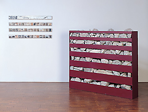
Robert Smithson, "Non-Site: Line of Wreckage, Bayonne, New Jersey"


Martha Rosler, "The Bowery in Two Inadequate Descriptive Systems"


Joesph Kosuth, "Chair"

Chris Burden, "Shoot"

Forgive me for this additional Greenberg quote. The first week of the quarter is Greenberg week in Darby English's class.

“The question now asked through their art is no longer what constitutes art, or the art of painting as such, but what irreducibly constitutes good art as such. Or rather, what is the ultimate source of value or quality in art? And the worked-out answer appears to be: not skill, training, or anything else having to do with execution or performance, but conception alone.” --Clement Greenberg, "After Abstract Expressionism" 1962

I have conceptual art on the brain, as I am considering writing about it for this class' seminar paper. I have always felt that the 1960's and 1970's produced my favorite artworks. My recent journey back in time to the modern period for my thesis work and a couple of classes has been in pursuit of a better understanding of where these works from "my favorite art movement" came from. As much fun as it is to study contemporary art all day everyday, I felt like this graduate year would be a good opportunity to fill in a couple fuzzy areas in the modern period where I could use some more work. As I suspected, it has been extremely informative and additionally pushed me back towards "my absolute favorite period"--early contemporary, or the 60's, 70's and early 80's, with a better understanding of what was at stake for these artists and their position in the 20th century. The birth of the conceptual as the new basis for art making, which this Greenberg quote surely speaks to, is where I find the most compelling art. This mock exhibition is a tribute to what I consider to be the very best works of "my favorite art historical period." That said, my work in the modern period this year has also got me thinking about what I want my long-term graduate project to be. It is now the connections between the two periods of modern and contemporary that I plan to focus on. More specifically, I want to work on understanding how the issues of the avant-garde are addressed in the early part of the post-modern period by studying both modern and contemporary art. This class might provide me with the chance to get started on this larger project, since I can pick a paper topic that addresses the transition from modern to post-modern art.

Finally: a Poll of my own. Who votes for this as the first conceptual art piece ever? If not, who do you vote for?
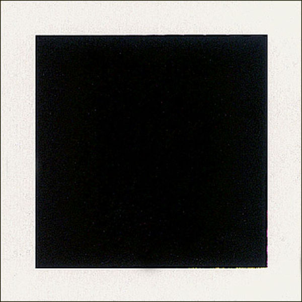


Kazimir Malevich, "Black Square"

Friday, April 2, 2010

This American Life: Avant-garde and Kitsch (Curating with the help of Greenberg)


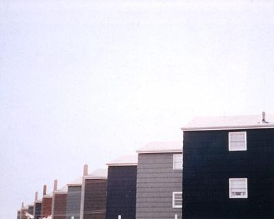
Dan Graham "Homes for America"


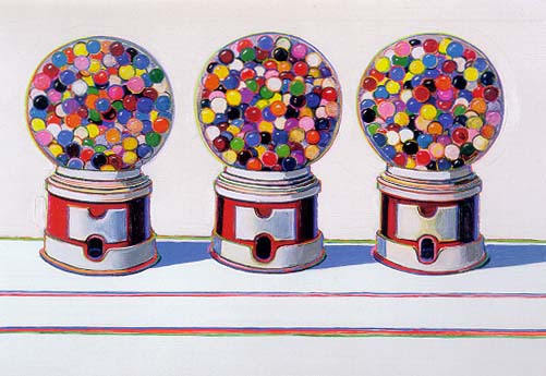
Wayne Thiebaud "Three Machines "


Ed Ruscha, "Every Building on the Sunset Strip"


"Kitsch is mechanical and operates by formulas."

Larry Sultan
"In Repin's picture the peasant recognizes and sees things in the way in which he recognizes and sees things outside of pictures--there is no discontinuity between art and life, no need to accept a convention and say to oneself, that icon represents Jesus because it intends to represent Jesus, even if it does not remind me very much of a man."

Andreas Gursky "99 Cent"
"In turning his attention away from subject matter of common experience, the poet or artist turns it upon the medium of his own craft"

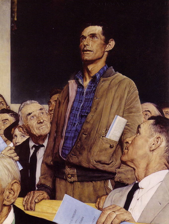
Norman Rockwell "Freedom of Speech"
"Kitsch is vicarious experience and faked sensations."

Kitsch is easy enough to identify when you are using the dated aesthetic of Normal Rockwell or this glorious example of 70's kitchen art as a set of visual guidelines. Ask any art history student to identify the most memorable images that result from reading Greenberg's "Avant-garde and Kitsch" and Rockwell's images will no doubt surface. Yes Rockwell is the poster child of Kitsch in the most basic understanding of the concept. Anyone who has been trained to have an analytical eye towards images can dismantle this Rockwell's ideologies in a heartbeat. The impassioned look of the powerful working class american citizen--it's just too easy. Same with the kitchen art. It is a representative of the all too undervalued category of craft, and additionally decked-out in 70s colors. Both of these two pieces just reek of mid 20th century american nostalgia--not that this is a value judgement. What I am pointing out here is that when kitsch is seen to look like this, it is not difficult to jump on Greenberg's bandwagon. There is Mondrian and there is Rockwell--easy enough to understand. Greenberg's contrast between Picasso and Socialist Realism is just as manageable.
The rest of these images are not placed here in order to make an argument for them as some kind of more contemporary kitsch. Far from it. Sultan and Gursky are two of my favorite contemporary photographers, and are considered as "high" as "high-art" can get in the contemporary sense. I put the rest of these images here as offering very different yet all "high-art" takes on some form of Americana. Theibaud and Gursky both take candy as their subject matter in the Greenbergian sense, yet choose two media with different associations, and stand in for two very different movements within contemporary art. Much is at stake when Theibaud uses the medium of paint as a pop artist, just as it is when Gursky manipulates digital photographs.
If I were to try and design some kind of argument that would encompass all of these images it would no doubt have to exist in the form of a book. So instead what I am doing with this virtual exhibition is allowing you, the viewer, to try to navigate these images with the proposed concepts in mind.
The Status of Kitsch in America--how do we identify it when it is not as transparent as Rockwell? How do we understand Greenberg's notion of Kitsch NOW? Can we see it as transparently when it is not as dated as these two obvious examples?
Mass Production as an American Value--as it is frequently explored in post-modern art. How do we tie this to Kitsch (without referring to the easy answer, that is, Rockwell's jab at Greenberg with his image of the viewer admiring a Pollock. Again, TOO EASY.)

And finally, what about Greenberg's "Russian Peasant"? What about the notion that there is some kind of innate human conception of taste that is linked to an accurate representation of the visual world? Bazin refers to this as the psychological desire of the plastic arts, or the drive to duplicate the world. We know what Greenberg says about the peasant's view of Picasso, but what about Cy Twombly? If Greenberg's point with this comparison is that the "uncultivated" viewer will prefer the representation of narrative and identifiable figuration that is found in Soviet Realism, then what can we say about photography? It has an excuse for narrative that painting doesn't (that is, some notion of indexicality that still exists in the real world even if it has long since been denied in academia.) Contemporary tastes in photography still mostly necessitate figuration of some sort, if not narrative. But I'll stop before this turns into a plea for abstract photography to be taken more seriously, or we could be here all day...

postscript: If you were not in Chicago this fall check out the smart museum's past exhibit "Heartland" as well.

Wednesday, March 31, 2010

art photography in the vernacular


These are all photographs taken by my favorite amateur photographer, my boyfriend Ken. The images were the result of a project he completed while crossing the country in his 1987 Toyota Cressida. His trip started in San Francisco and ended in Chicago, so he stayed close to route 66 the whole way. Considering that the history of photography is one of my main areas of interest, and the category of amateur photography is becoming increasingly more important to the contemporary practice, I find myself extremely drawn to these images. While I spent a good deal of this academic year reading about surrealist manipulations of the medium, I keep coming back to more contemporary investigations. In my mind there is an undeniable link between the modern photographers and the contemporary digital artists like Gursky and Wall. Throughout the century there is a continued interest in the photograph as documentary, no matter how much that notion has been contested in academia. The rise of vernacular photography, as evidenced in the proliferation of exhibitions like the one currently at the art institute "In the Vernacular," still has at its heart these questions of authenticity and the camera's documentary role. I know this to be true because these remarkable images were produced only because Ken wanted to "document" his trip across the country. It was this exact word he used over and over when I asked about his project.

There is no question that these images make a case for the surreality that results from the automatic nature of the photographic medium. These could stand as contemporary examples of exactly this principle that the surrealist photographers were so fond of. Many of the effects I find to be compelling in Ken's images resulted directly from faults in the cameras he was using, and his haphazard photo-taking techniques (sorry Ken, I know how you take pictures).

What is strange is that these photographs can be seen to represent both sides of the debate. On the one hand, they are extremely personal and as previously mentioned, meant for documentary purposes. They are definitely in the vernacular. They also have that "americana" quality that is so typical of contemporary photography practices. The roadside structures, landscapes and strips of highway bring to mind Ed Ruscha and Edward Hopper at the same time. Yet the surreal effects caused by the automatism produces the kind of beauty that belongs to art photography. It is precisely their abstraction and separation from visual truth that makes them beautiful. Ken has stumbled upon an image-making process that addresses both sides of this century-long debate.

a voice from beyond?

source

The voices of advertisers come at us from everywhere. Radios, T.V.s magazines, websites. They keep coming up with more and more places to place ads. Soon we will all have to check ourselves into institutions to escape from the voices. Millions of people make millions of dollars telling us what we want to hear, asking us to tell them what we want to hear, so they can tell us what we want to hear so that we buy products they want to sell. This is nothing new, and neither is the subject of today's post: billboards. To me, billboards are by far the most fascinating of all advertising methods. For one, there is the proximity to the heavens. As much as we are used to advertising voices filling our airspace, there is no denying that a message that appears to come from the sky, in HUGE writing, is bound to strike up some associations. Especially since billboards frequently rely on declaratives. What could a message from god possibly look like, if not a GIANT DECLARATIVE SENTENCE COMING FROM THE SKY. Another fascinating aspect of billboards to me is the visibility of aging and layering. No other advertising method allows you to see the previously placed pealing messages of the past. I find the layering to be a kind of literalization of time passing as viewed through a progression of images. For someone like me that loves all things old, historical and visual, it doesn't get much better than that. There are also the particular kind of aging advertisements painted on the sides of buildings. These are much more common in Chicago than San Francisco, since Chicago is a much older city. To me these faded messages read as much like ghosts of old versions of neighborhoods as anything ever could.

Tuesday, March 30, 2010

invisible aesthetics

For the first set of images I decided to start with an aesthetic comparison. As a native San Franciscan and recent Chicago transplant, I have a personal investment in both of these frequently overlooked, visual components of the two cities. The top image depicts a staple of domestic Chicago architecture--the back stairs/entrance or fire escape. I was informed when I first moved here about 6 months ago that these became the standard for Chicago homes in response to the devastation caused by the Chicago fire. As a San Franciscan, I'm used to a much different conception of population density; the idea of each pair of streets having their own alley and separate entrance was initially completely baffling. This feature has become one of my favorite aspects of the city's architecture. Row after row of these fantastic wooden fire escapes line the alleys. With the endless flatness that is mid-western terrain (another novelty to me), truly astounding visual experiences can result from a peek down an average alley way. This photograph captures the contrast of the brick and wood structures that I find to be so compelling. Every time I encounter one of these structures (including walking up my own alley and staircase), I cannot help but feel that I am experiencing the private, inner life of a city's structure.

San Francisco's Muni lines may not be entirely in line with the kind of aesthetic that comes to mind when picturing the city's Victorian architecture as it reflects bright California sun light. Psychedelic paint-jobs, monumental bridges, and the kind of views that could only result from the city being built on a series of endless vertigo-inducing hills--these are the images found on post-cards of San Francisco. These images explain appeal to the countless under-dressed tourists who come to the city only to be shocked by the fact that it is normally 20 degrees colder than the imagined California climate. There is no question that the city of San Francisco offers a range of aesthetic experiences that are amplified by the prominence of the city's bright light and color. But one important aesthetic component of the city that is specifically meant to go unnoticed is the web of wires that enclose the city. Muni wires are everywhere, and they provide a completely unique service to the aesthetic of the city. They create an intimacy to the urban space, and also a sense of connectedness. The most famous landmark of San Francisco may be the Golden Gate Bridge (I've been told it is the most photographed structure in the world); but if you ask anyone who has lived in San Francisco about the Muni lines instead, my guess is you will get a much more impassioned response.

So what can be said about looking at the city structures that inhabit our visual fields and shape our experiences on a daily basis, when they are often meant to be invisible? There is a massive web that entangles the city of San Francisco and it necessarily changes its inhabitants' experience of their environment on a daily basis. It is entirely present and visible, yet most of the time, it is exactly the opposite.

statement of purpose

In the twenty-first century images are everywhere. We notice them, analyze them, engage them, ignore them, enjoy them, seek them out. We watch T.V., and movies, go to see art, pass by advertisements, decorate our homes—we live in and around images at all times. These images have categories and terms of engagement. We determine our levels of engagement with these images by their categories. As an art history student, I was taught the traditional art historical methods for engaging art objects, and learned how to adjust these methods depending on what the object demands. But my desire to understand all the images that inhabit every corner of my life extends beyond studying art. This blog is an effort to delegate some space for the analysis of images that do and don’t get printed in art history text books, hung on museum walls, or illuminated by projectors on classroom screens. In academia, there is a slow change occurring that reveals a desire to acknowledge the place of images in contemporary culture beyond the disciplines of art history and film studies. Classes and sub-departments dedicated to media or visual studies hint at the fact that the traditional academic disciplines can be seen to have blind spots in these areas.
But for some dedicated image-enthusiasts such as myself this change isn’t happening fast enough.
Each post will offer some analysis of images, related in content, context, or aesthetic quality, that I come across in any of the previously mentioned channels. My analysis of these images is posited only as a starting point for what I hope to be discussions that will give these images the critical attention they deserve.